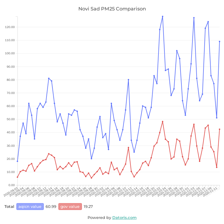
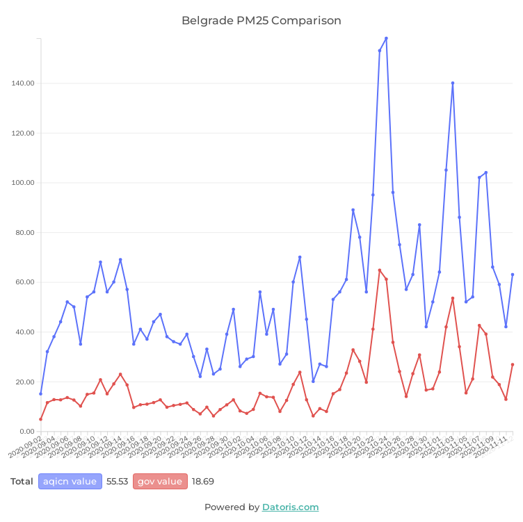
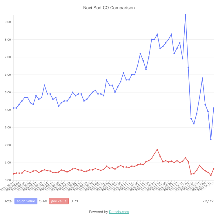
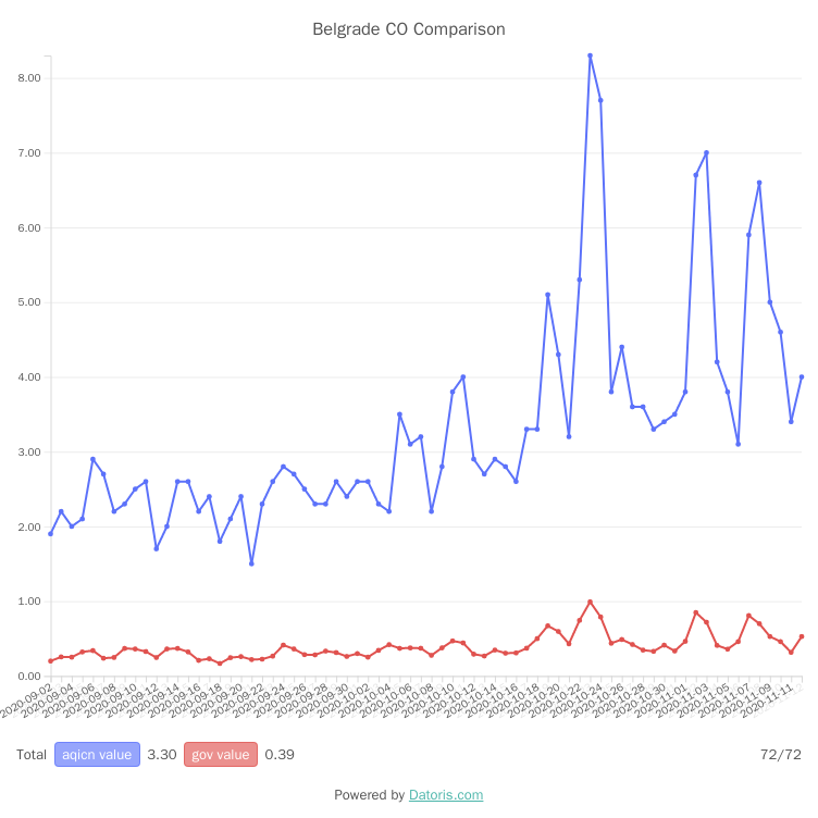
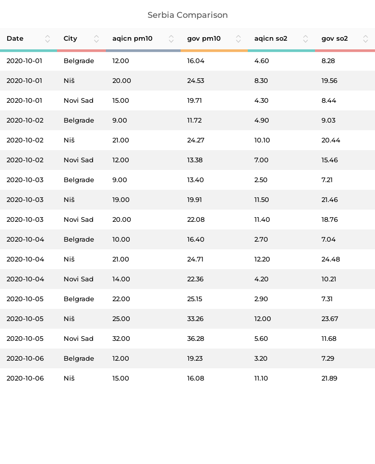
Comparison between different sources of air quality data in Serbia was our pitch at the first Solution Lab by the Independent Journalists' Association of Vojvodina (NDNV). You can read more about the contest here.
These charts were produced to illustrate how one government run and one international source, although mostly based on the same measurements, report significantly disproportionate information. We don't claim there is any agenda. Deeper investigation is required. With the limited time and resources we had, and the unconfirmed data we were able to retrieve, this is not a definitive result. It shows that relying on mobile apps and various air quality indexes is a very slippery terrain. Given the potential health consequences, there must be some kind of quality control.
With the resources permitting, we would like to include more data sources into comparison, get in contact with data providers and understand the differences, automate data retrieval and make it current as much as possible, and publish the results in the end. This should drive a discussion about the problem, and improve the quality. For now, we can only share this preliminary result, and distance ourselves from any use of it.
We will be happy to discuss about our methods and extending the analysis to include more data. Don't hesitate to Contact us!
Data sources used:
Serbian government data was downloaded from Serbian open data portal.
Air quality index data was downloaded from World Air Quality Index (WAQI) project website.
