The data source I wish I had
A challenge we faced early on while developing Datoris was finding data to feed it. We assumed there’s tonnes of open data online so, confident we’d find just what we needed, we added a few check boxes any potential data source we’d use publicly in our application should tick:
- Not too small, and not too big
- Having a theme interesting to as wide an audience as possible
- The theme should not be trivial but also not grim (deaths, accidents...) or controversial
- The data should be current
- The data should be able to showcase Datoris’ capabilities
- Data usage should not be restricted
Where do interesting datasets live?
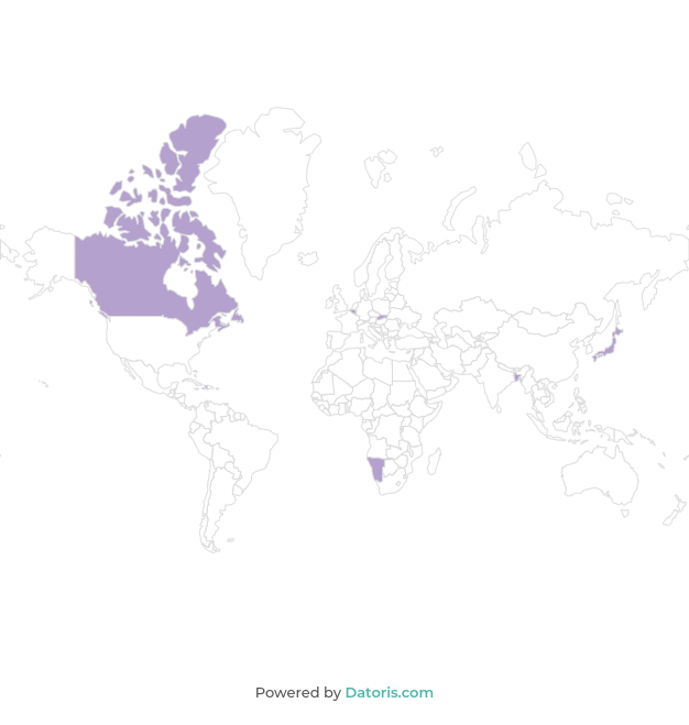
The second requirement eliminated all the country-specific .gov websites hosting statistical data, because we didn’t want to limit the appeal of a dataset primarily to residents of any specific country. It also eliminated sources like the EU Open Data Portal, U.S. Census Bureau, Data.gov and the like and has directed our search towards international organizations which accumulate and publish data - like the UN and its various branches (World Health Organization, Food and Agriculture Organization…) and the World Bank.
Even though the data available from those organizations is overwhelming in quantity, we soon found it hard to fulfill the second requirement which, compounded with the third and reading between the lines a bit, said the data should be as fun as possible. We hoped to find the “fun factor” in both the data’s theme and in other properties of datasets. For example, a dataset with a single indicator (a metric) would be “duller” than a one with many, which would offer more analytical options and be able to better demonstrate the application’s features. A data source with many indicators allows for filtering, grouping, sorting and applying other transformations simultaneously, which can then provide a richer insight into the data.
We could have done without the fun factor to showcase what the application can do but the idea was to get visitors to try some exploration of their own, using data we’ve made available. Supposedly, not many would dive into data focused on economy, energy, education… Not because these are dull subjects but because most people would be, perhaps, unfamiliar with their various metrics, as presented in relevant datasets. The intention was to showcase the seriousness of the application’s drill-down capabilities, not the seriousness of the data being explored.
For our purpose, datasets available on the UN’s website are too fragmented and would require more work than we were comfortable with doing, in order to make them suitable. For example, in the demographic statistics section, there are a number of different but complementary datasets on population (population by religion, population by national/ethnic group, population by literacy…) which would serve our purpose better if they were joined into one. On the other hand, joining them would make the resulting data source too large.
We encountered similar problems with data from World Bank - related indicators fragmented among individual datasets and themes which we didn’t find quite hit on our fun factor. Also, a common sore point with data both from the UN and World Bank is that measurements are not taken or updated equally often for all indicators. Some are up to date, some are a year or two late but some have not been updated for many years and so, combining these datasets would produce missing data. Missing data isn’t a problem in itself but we were looking for contemporary data, for much the same reason we were looking for fun data. Any data gradually becomes outdated and, while publishing it is an effort, keeping it current is perhaps an even bigger one. This, as you can imagine, further complicated our search.
Are we there yet?
Back to the search, we checked some more places with open data, like Google’s Public Data search engine and the Registry of Open Data on AWS. The former makes it easy to glance at datasets from different sources (governments, organizations, websites…), covering a range of themes. We found similar problems with datasets here as already described. Datasets found on the latter, however, tend to have interesting but highly specialized subjects, such as: a collection of all Amazon reviews ever published, public data from a German bank, trip data from NY Taxis, IRS Filings, data from the National Oceanic and Atmospheric Administration, machine learning datasets, satellite data and many others.
Next we came across FiveThirtyEight and Kaggle. The former is a place where journalists and other authors share data used, for example, in writing articles. There are a lot of datasets related to politics, such as the popularity in the polls for the current US president, democrats vs. republicans in congress and a lot of US sports related datasets there (NBA, NFL…). These are mainly country-specific or narrow in interest and were dismissed. Finally, Kaggle is a place which hosts data sources created by its users. As you can imagine, datasets on a wide range of subjects, like statistics about songs on Spotify, different cryptocurrencies and sex offenders, can be found there.
Now that I found you, I think...
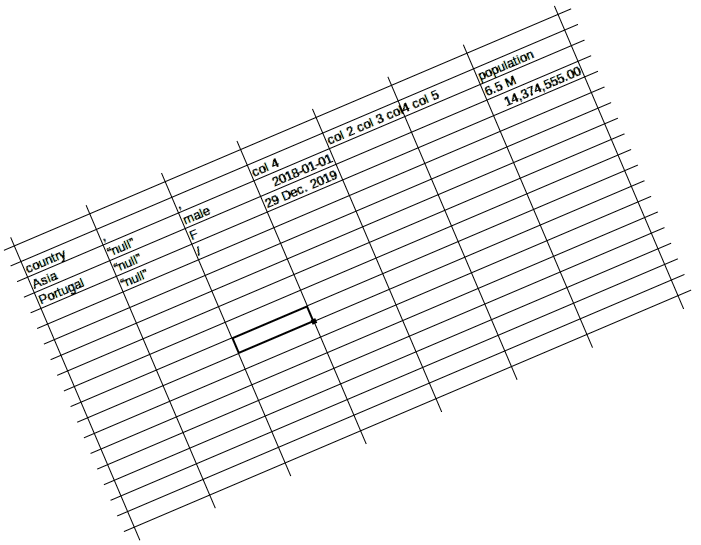
Datasets released by institutions tend to be neatly structured and have context explaining different metrics, if necessary. Some even contain basic descriptive statistics. On the other hand, data shared by individuals sometimes falls short in this regard. There are examples of datasets with nonsensical column names and no context whatsoever, making the data in them practically unusable. More often, however, there are smaller problems:
- Irrelevant columns (ID’s, links to images and such)
- Column names several hundred characters long
- Non existent values entered as text (“null”, “NA”)
- Factual errors
- Number formats which don’t allow arithmetic operations ("10K", "1 ft")
...you need to change
Some of these problems were easily addressed in Datoris’ UI: changing column names, data type or completely removing a column after a data source was imported into the application. Others, we’ve had to address in the datasets themselves - transform values from the imperial to the metric system or transform notation (“K” to three zeroes or removing “ft”).
We had to update some datasets (Emmy awards and the Oscars) by adding the results from the latest year. Since the most recent year in the Olympic games athletes dataset was 2016, and since we knew it was created by scraping a website, we thought to update it too, normally, and proceeded to write the script and put it in action. It took hours to complete but it produced no results so we error-checked the script and let it run again. We were scratching our heads when the second run again returned nothing, only to realize that the website we were scraping simply didn’t add any information for the 2018 games.
In the end, we had found sufficiently fun datasets, in both theme and the amount of indicators, but the internet didn’t just hand them over. Some work was done transforming data and making the datasets correct and presentable so anyone could dive in, analyze, and find, for example, which footballer played for most clubs, after their age of 25.
There's definitely tonnes of data online
There are a lot of places online, hosting open data and most of it is freely licensed or perhaps requires attribution. The data varies in every way imaginable, otherwise, and finding a fit for a specific purpose isn’t always easy (but should be accomplishable). With the work now done, we see that the requirements we put on our search were pretty tough to fulfill. On the other hand, if you’re looking to answer a specific question using open data, things become much easier. UNData would let you answer “which country has the highest fertility rate per square kilometer of arable land”. Joining data from the World Bank you could answer something about the GDP and the elderly population of Hawaii, for example. Hopefully, the topic of your interest in search for open data will fall to something the institutions report on. Otherwise, your mileage may vary - there is good data, in weird formats, data which requires some work, or so much work it isn’t feasible and there is data which is perfectly kept and ready for use.