Thought process behind the decision to create the dashboard
There is no fixed date when Datoris launched. The prototype was first developed and pitched back in early 2017. It had some rudimentary UI in the browser, it was capable of reading from database and executing queries based on what user selected. Reports were displayed in a tabular form only, but it had basic features of an analytics tool. The team formed in late 2018. Presenting what we do was becoming more important, and we worked on adding some public sources and reports whenever we thought there were new features worth showing. We wrote about pains of open data on the internet in one of the earlier blog posts.
In the early 2020, it was time to start conquering social media. That’s what we thought will bring us visits, and some of those visits will become customers. Our view of social media and our archetype customer changed since then, but at the time, we were going for some widely known, interesting, data rich and visualization friendly phenomenon, like the Olympics, the Oscars, or the US elections. All of those events were supposed to happen later in the year, so we would have a head start. The pain of open data is its incompleteness, we wanted to show what Datoris can do, not to type thousands of actors first names, just to populate missing values from a source we downloaded. With the US presidential elections, we had no clue how they work. We still don’t. It wasn’t just about stuffing some data somewhere and arranging some charts. The topic was supposed to be something we know about and can say something meaningful about it.
News from China about the Coronavirus started in late January. It looked surreal, people with masks, cities in lockdowns, a hospital built in a couple of weeks. “The West” was, as usual, making fun of them, self centered and smug about anything different. But, there was something. Although mainstream media was reporting on it as a curiosity, the experts were not so casual. After all, China wouldn’t be where it is globally, if it was led by a bunch of paranoid germaphobes. First cases outside of Wuhan were reported, then outside of China, then in Europe.
So, we thought there is something to it, and started looking for good data sources. As always with public data, there was no standard, no single authority, no formal verification. We considered several sources, like Wikipedia, Worldometer and some media. Data was either incomplete, already aggregated or not updated regularly. In the end we stuck with Johns Hopkins University. At the time, it looked like the best option, as it provided raw data and was peer reviewed. There was a handful of dashboards, including the one from Johns Hopkins. They seemed limited, centered around some region, or focused on some specific characteristics of the virus, like the spreading, mortality, or the timeline. We thought we could contribute, and perhaps enable people to explore the data by themselves. Datoris is a tool, not just a place for pre-built reports.
Technical details about data acquisition and processing
Initially, Johns Hopkins data was published as a Google Sheet. It was read only for the general public. To this day we don’t know who populates the data, but at the time they didn’t seem like a data science savvy bunch: date formats were all over the place, each day was published as a separate sheet, the columns would vary, their ordering changed, values were missing, added after several days or even weeks, country names changed, disputed regions got independent or dependent as editors felt like, so you had to re-populate, and fix manually every couple of days. They were getting many complaints, and I guess gradually it became clear that this data source is becoming important as the virus progresses. They moved to CSV files, stored in a Git repository. Several format changes later, the quality got better, but was never above barely acceptable. Current (end of 2020) number of 1400 open issues, that many closed, and 16000 forks tells a story of public collaborative data on the internet very well.
As the COVID-19 pandemic seems to be here to stay, and new data comes in every day, we need an automated process of populating our data source, and generating reports for the dashboard scheduled daily. We have a cron job which pulls the updates from git, triggered twice every day, because there is no fixed time when new data gets published.
30 3,15 * * * /datoris/coronavirus/update_data.sh >> /datoris/update_data.log 2>&1The script is pretty simple, it pulls changes from the repository and executes populate_table.sql file in our database
#!/bin/sh
cd /datoris/coronavirus/jhu_ccse_git_data
git pull
docker exec datoris-db psql -d dbname -U dbuser -f /datoris/coronavirus/populate_table.sql
We used PostgreSQL database in this case. Some of our data sources are in H2 in-memory database. This is fine for smaller, rarely updated data sets, as the data is persisted in CSV files on disk, and loaded to memory when needed. Having to replace files and then refresh in-memory tables in H2 is a possibility, but using a proper database seemed easier.
This script was executed only once, to create the table and define available columns. Note that "Last Update" is stored as text, and not as date or timestamp. Format was so inconsistent that it was impossible to predict and handle all possible variants.
CREATE TABLE IF NOT EXISTS coronavirus (
    "Province/State" VARCHAR NOT NULL,
    "Country/Region" VARCHAR NOT NULL,
    "Observation Time" VARCHAR NOT NULL,
    "Last Update" VARCHAR NOT NULL,
    "Confirmed" INTEGER,
    "Deaths" INTEGER,
    "Recovered" INTEGER,
    UNIQUE("Province/State", "Country/Region", "Observation Time")
);
Data has to be cleaned up and enhanced with additional columns, to delegate some complexity from reports to database. That is why we have a view as a layer between the raw data and the consumer. This is a common practice in business intelligence. Source data can be dry, as simple as possible, addressing different audiences, like APIs or batch processes. Analytics facing data should be human readable, complete, consistent, easy to aggregate and filter. There is a lot going on in this view, null values are populated (e.g. COALESCE(confirmed, 0)), inconsistent values are corrected with a bunch of CASE statements, there is a subquery which determines which table rows represent last available data, and there are window functions, calculating the difference between the current and the previous day. These additional columns are later used in reports. It would be possible to have them defined in report field formulas, but this is much simpler.
CREATE OR REPLACE VIEW coronavirus_view AS
    SELECT
        province_state,
        country_region,
        observation_time,
        last_update,
        COALESCE(confirmed, 0) AS confirmed,
        COALESCE(deaths, 0) AS deaths,
        COALESCE(recovered, 0) AS recovered,
        COALESCE(confirmed - LAG(confirmed) OVER (PARTITION BY country_region, province_state ORDER BY observation_time), 0) AS confirmed_delta,
        COALESCE(deaths - LAG(deaths) OVER (PARTITION BY country_region, province_state ORDER BY observation_time), 0) AS deaths_delta,
        COALESCE(recovered - LAG(recovered) OVER (PARTITION BY country_region, province_state ORDER BY observation_time), 0) AS recovered_delta,
        CASE WHEN last_observation_time=observation_time THEN 'true' ELSE 'false' END AS last_observation_time
    FROM (SELECT
              CASE WHEN "Province/State" LIKE '%, AZ' THEN 'Arizona'
              ELSE CASE WHEN "Province/State" LIKE 'Chicago' THEN 'Illinois'
              ... AS province_state,
              CASE WHEN "Country/Region" LIKE 'UK' THEN 'United Kingdom'
              ELSE CASE WHEN "Country/Region" LIKE 'US' THEN 'United States'
              ... AS country_region,
              "Observation Time" observation_time,
              MAX("Last Update") last_update,
              SUM("Confirmed") confirmed,
              SUM("Deaths") deaths,
              SUM("Recovered") recovered
          FROM coronavirus
          GROUP BY province_state, country_region, observation_time
          ORDER BY observation_time desc, province_state, country_region) subquery1,
         (SELECT
              MAX("Observation Time") AS last_observation_time
          FROM coronavirus) subquery2;
We wanted to use built in Postgres CSV file data import feature. To be able to handle duplicates and unexpected failures, mostly due to faulty and inconsistent data, we opted for importing into temp table, then inserting into our permanent table, with ON CONFLICT DO NOTHING. Everything is wrapped inside a transaction. If the process fails, as it did on several occasions, we have to review the log, fix the data causing the failure, and run the script again. Temp table structure matches our CSV file structure exactly. Some columns were not used later. COPY statement is using PROGRAM capability, a shell command can be passed, to retrieve data in form of a CSV file. This was needed to add one more column to files pulled from git. As we can't rely on "Last Update" value consistency, because the date format varies for many unpredictable reasons like timezones, different users entering the data, different countries, different tools and interfaces used, we had to create our own, well defined and safe date column. We are using the filename, as it eventually got stabilized on MM-DD-YYYY.csv format, and we add it as an additional column to the CSV. Our shell command is doing exactly that: finding csv files, and appending their filename at the end of each line.
BEGIN TRANSACTION;
CREATE TEMP TABLE coronavirus_tmp(
    "FIPS" VARCHAR,
    "Admin2" VARCHAR NOT NULL,
    "Province/State" VARCHAR NOT NULL,
    "Country/Region" VARCHAR NOT NULL,
    "Observation Time" VARCHAR NOT NULL,
    "Last Update" VARCHAR NOT NULL,
    "Confirmed" INTEGER,
    "Deaths" INTEGER,
    "Recovered" INTEGER,
    "Latitude" FLOAT,
    "Longitude" FLOAT,
    "Active" INTEGER,
    "Combined Key" VARCHAR,
    "Incidence_Rate" FLOAT,
    "Case-Fatality_Ratio" FLOAT,
    UNIQUE("Admin2", "Province/State", "Country/Region", "Observation Time")
) ON COMMIT DROP;
COPY coronavirus_tmp (
    "FIPS",
    "Admin2",
    "Province/State",
    "Country/Region",
    "Last Update",
    "Latitude",
    "Longitude",
    "Confirmed",
    "Deaths",
    "Recovered",
    "Active",
    "Combined Key",
    "Incidence_Rate",
    "Case-Fatality_Ratio",
    "Observation Time")
FROM PROGRAM 'find /datoris/coronavirus/jhu_ccse_git_data/csse_covid_19_data/csse_covid_19_daily_reports \
                 -type f \( -name "*.csv" \) \
                 -exec sh \
                 -c ''f="$(basename "{}" .csv)";awk 1 {} | sed s/\\r// | sed s/$/,$f/ | tail -n +2'' \;'
CSV FORCE NOT NULL "Admin2", "Province/State";
INSERT INTO coronavirus (
    "Province/State",
    "Country/Region",
    "Last Update",
    "Confirmed",
    "Deaths",
    "Recovered",
    "Observation Time")
SELECT
    "Province/State",
    "Country/Region",
    "Last Update",
    SUM("Confirmed"),
    SUM("Deaths"),
    SUM("Recovered"),
    "Observation Time"
FROM coronavirus_tmp,
    (SELECT max("Observation Time") AS last_observation_time FROM coronavirus_tmp) subquery2
WHERE "Observation Time"!=last_observation_time
GROUP BY "Province/State", "Country/Region", "Last Update", "Observation Time"
ON CONFLICT DO NOTHING;
COMMIT;
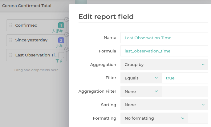
Now that we have the data, we should define our reports. We definitely want some overview charts, giving the totals, and a change since yesterday. These are quite simple to make. Since our data source is cumulative, each entry contains all cases up to that date, so we need to sum all regions on the last date. Change since yesterday is already calculated by the view. “Last Observation Time” column is perhaps a curiosity. We have to have a condition on a column which we don’t want in the chart. We might have added it in one of the remaining report fields as a custom filter. Having a column explicitly added to the report but excluded from a chart is arguably more expressive, so we chose that option.
Geo chart utilizes natural logarithm to enhance contrast between values of different magnitudes. It maps numbers from a wider, continuous range to a smaller, discrete range, which was exactly what we needed to show number of infected people as color shades.
CEIL(CASE WHEN SUM(infected) <= 0 THEN 0.0 ELSE ln(sum(infected)) + 1 END)Getting countries with most new cases relative to their total number of infected until that day was also quite easy, because we took an effort when we created the view to have the change since the last day in each row. Another thing worth noting is null division check, to avoid getting exceptions from database.
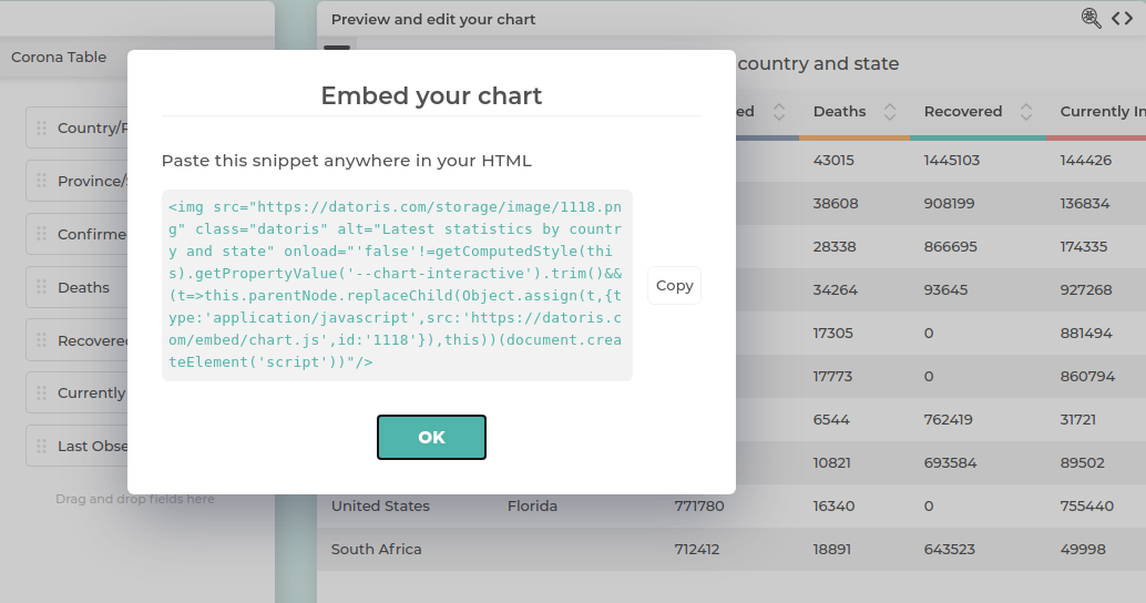
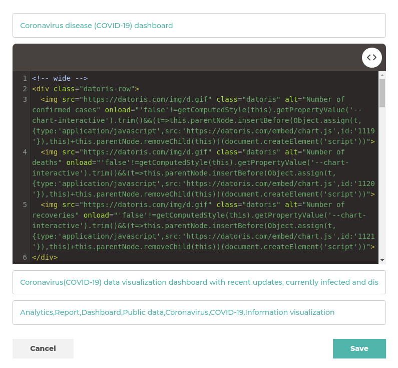
ROUND(CASE WHEN SUM(confirmed)=0 THEN 1 ELSE SUM(confirmed_delta)/SUM(confirmed) END, 2)Last order of business, composing all charts on a dashboard. Our website has modest CMS capabilities, so we created an article, copied embedding snippets from each chart and pasted them as html in the article.
They are arranged by using datoris-row css class to define the layout, chart responsiveness is handling dimensions based on the screen size.
With such a sensitive topic, and concerns about misinformation, potential impact on the public, creating confusion or getting censored on social media by editors, we were extra careful about data being correct, not focusing on cherry picked click bait views of the data, and providing some useful advice from an authority. Last thing we wanted is scaring someone.
Although dashboard refreshing is fully automated, there is still work to be done. Reviewing charts regularly often exposes some issues with data. For example, United States don't disclose number of recovered cases, so the total is always skewed. If data editors decide to change country name all of a sudden, like we had with Iran several times, deltas go crazy. The view thinks it's a new country, because there is no way to link "Iran (Islamic Republic of)" to "Iran, Islamic Rep." except from checking the data and doing it manually. This results in sudden increases, or even negative numbers of new cases and people mistakenly pronounced recovered because the country disappeared from data. Continuous monitoring is necessary and automated alerting in case of detected anomalies.